Le Monde Courrier
About

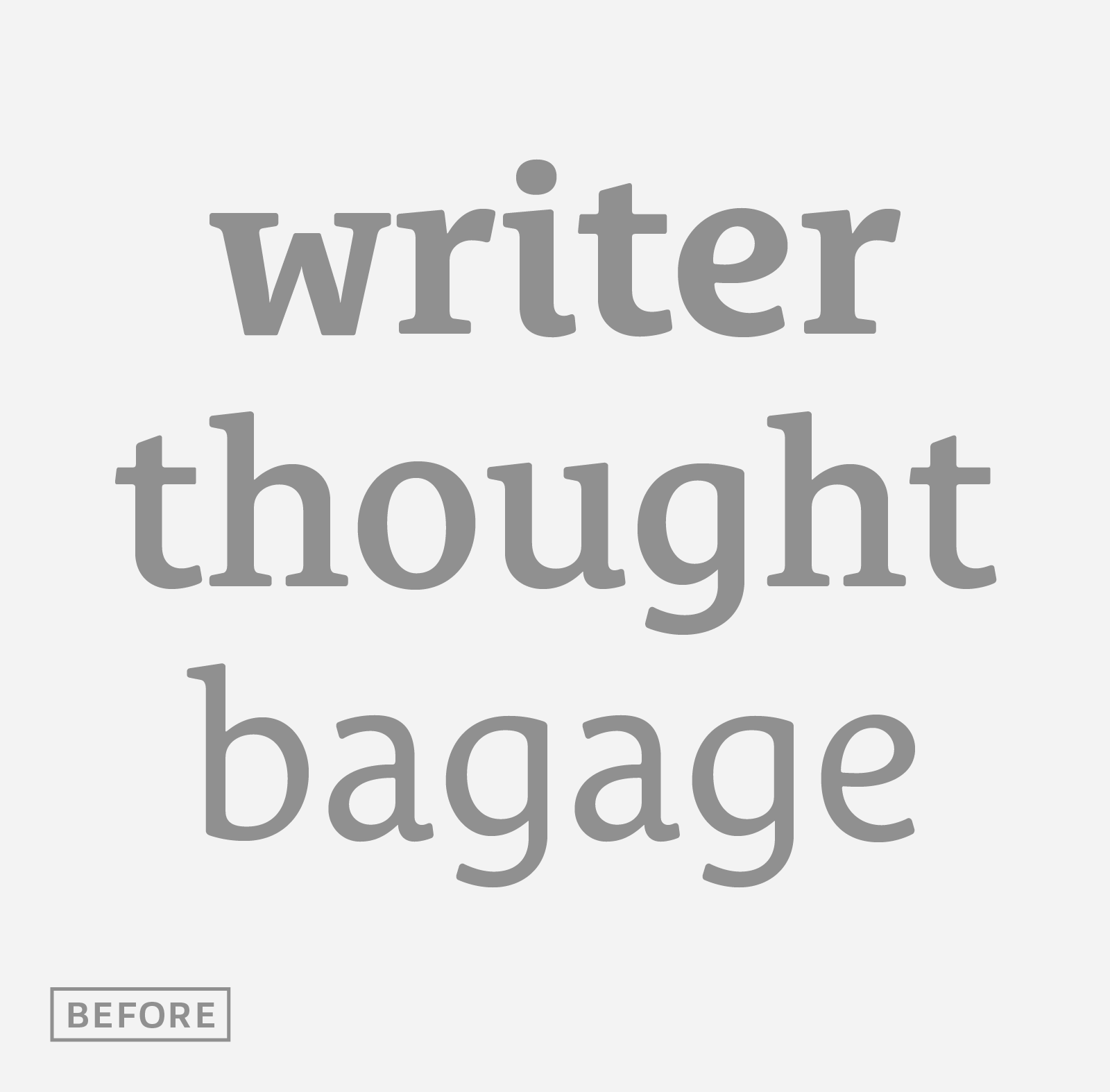
A rounded slab in 5 weights, romans & italics
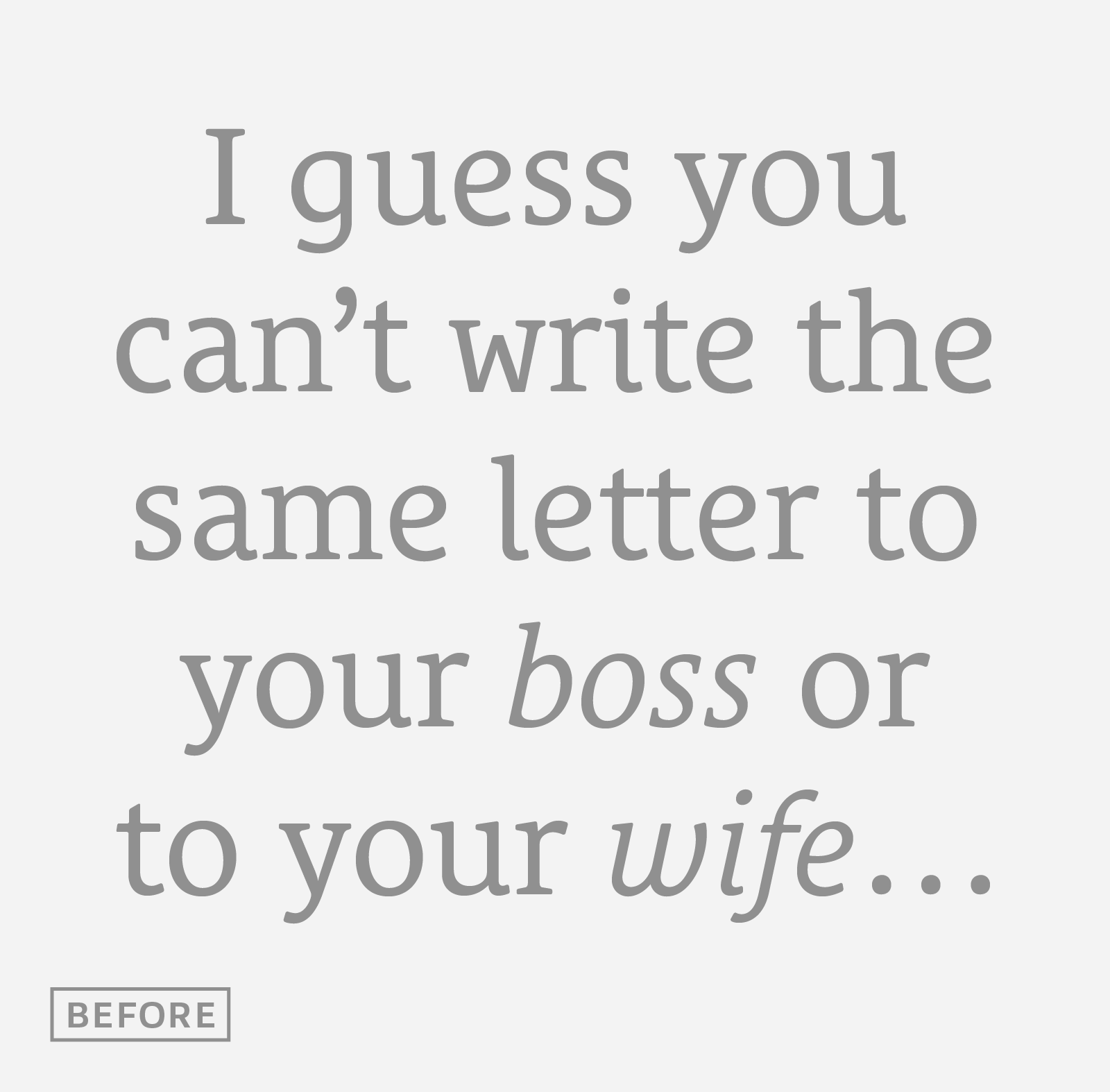
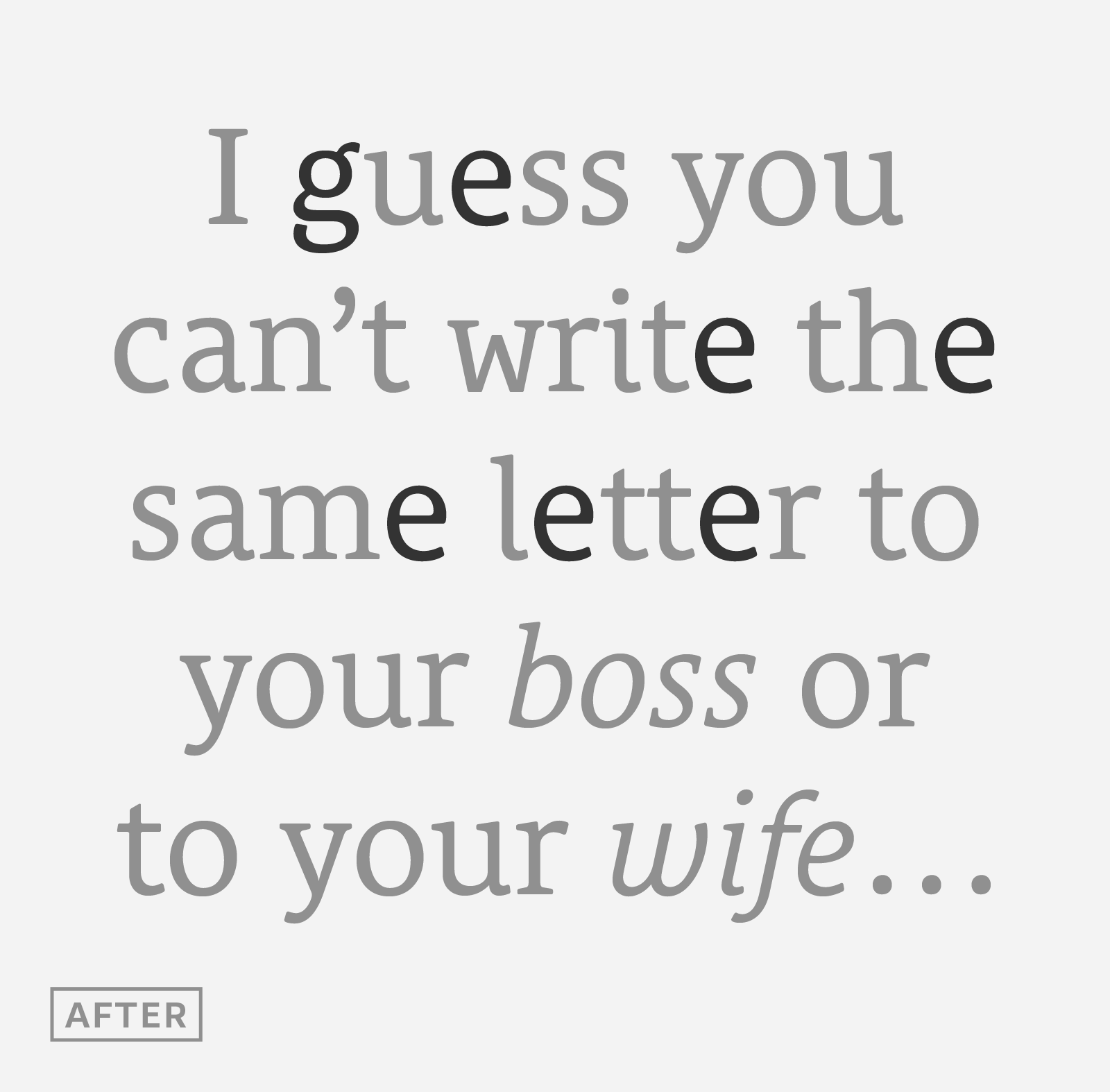
If you are looking for a typewriter typeface effect without the disadvantages of monospaced, this typeface is for you. It will bring this informal, friendly and rigorous touch to your graphic projects. It is also not a script, it remains a typeface built according to the usual canons that make it an easy-to-read text typeface. Le Monde Courrier, designed by Jean François Porchez, is an attempt to restore a style halfway between writing and printing.
Informal neo-tech style
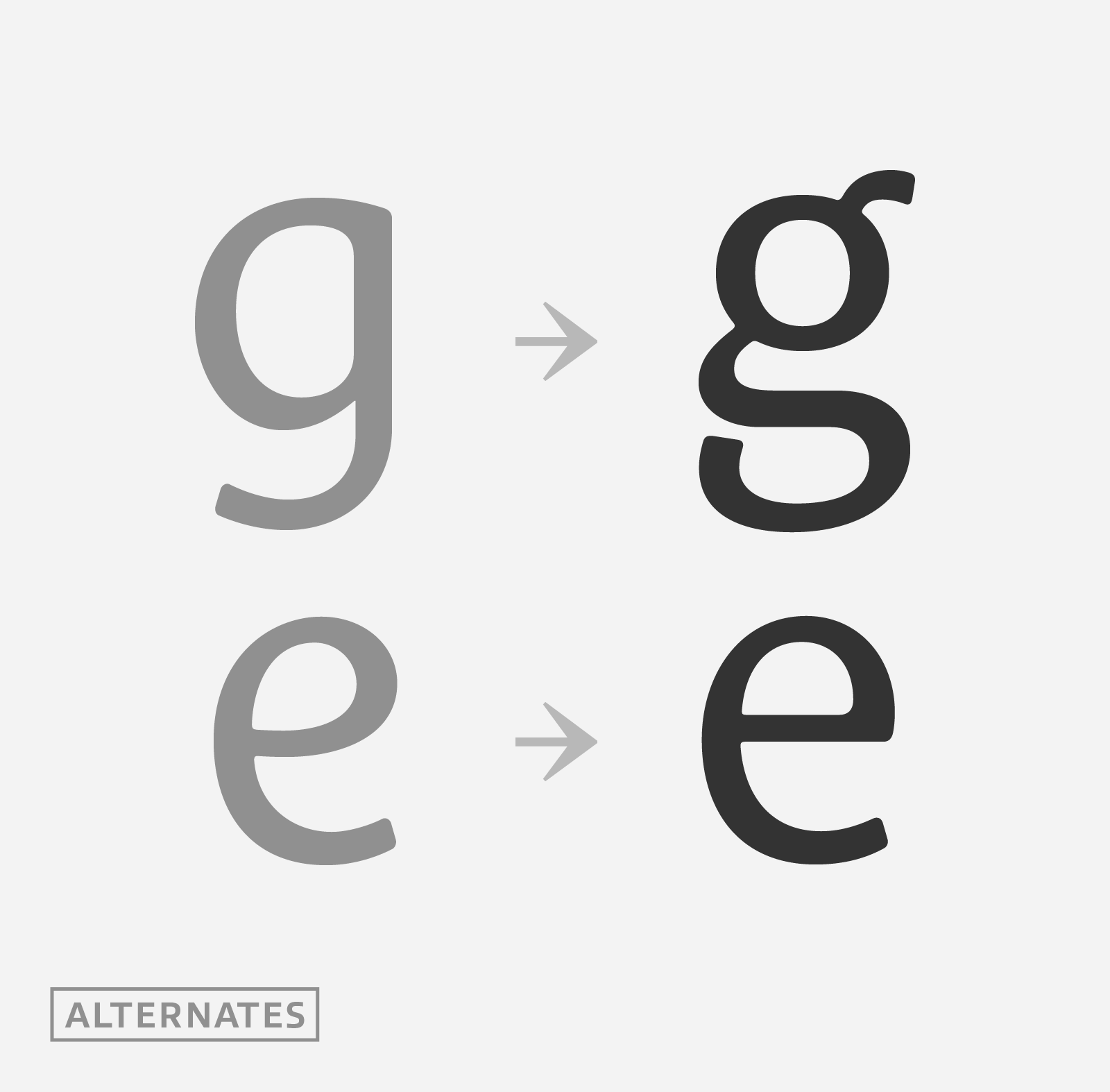
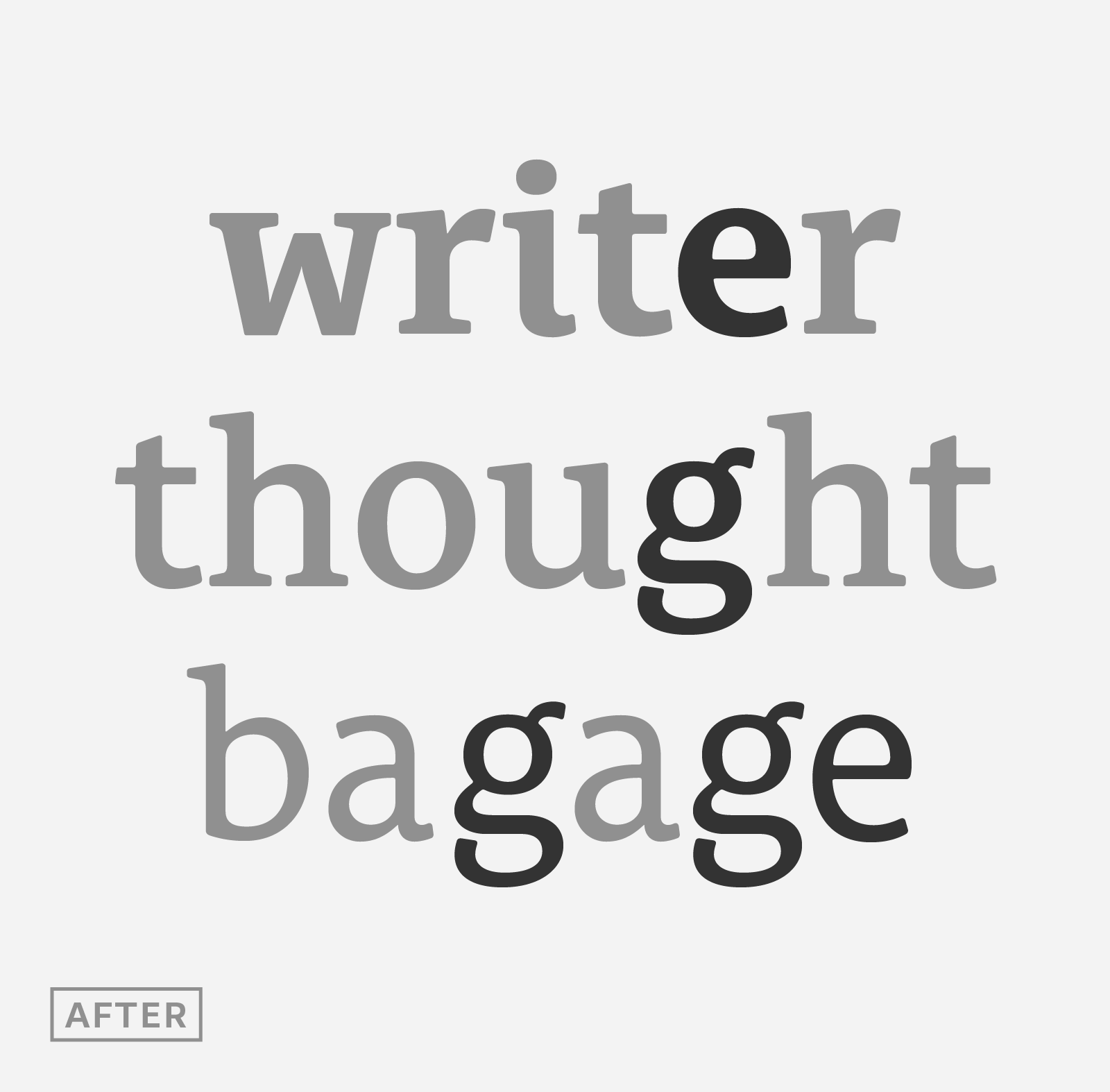
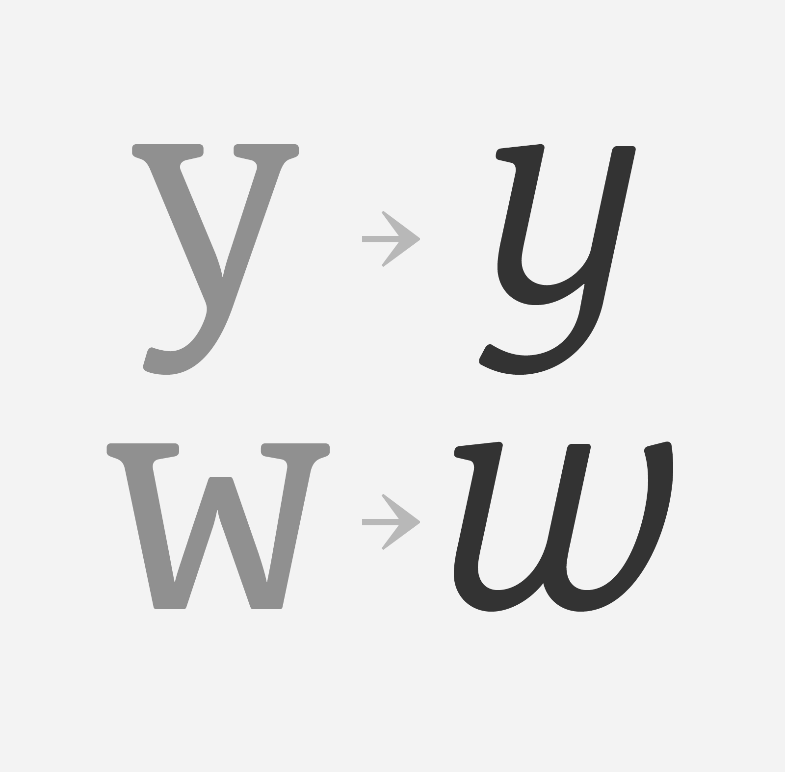
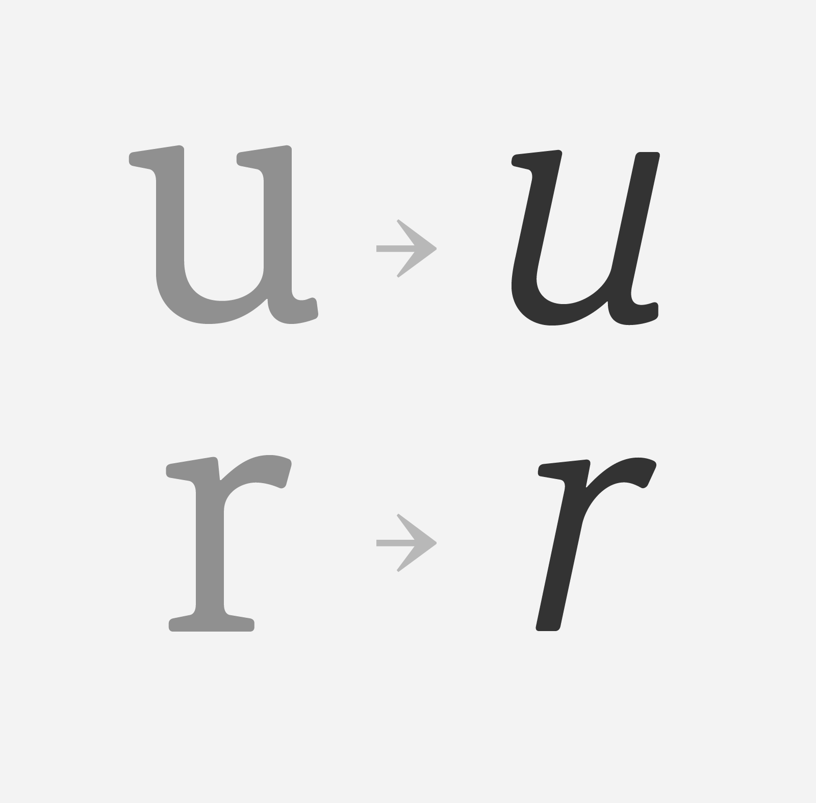
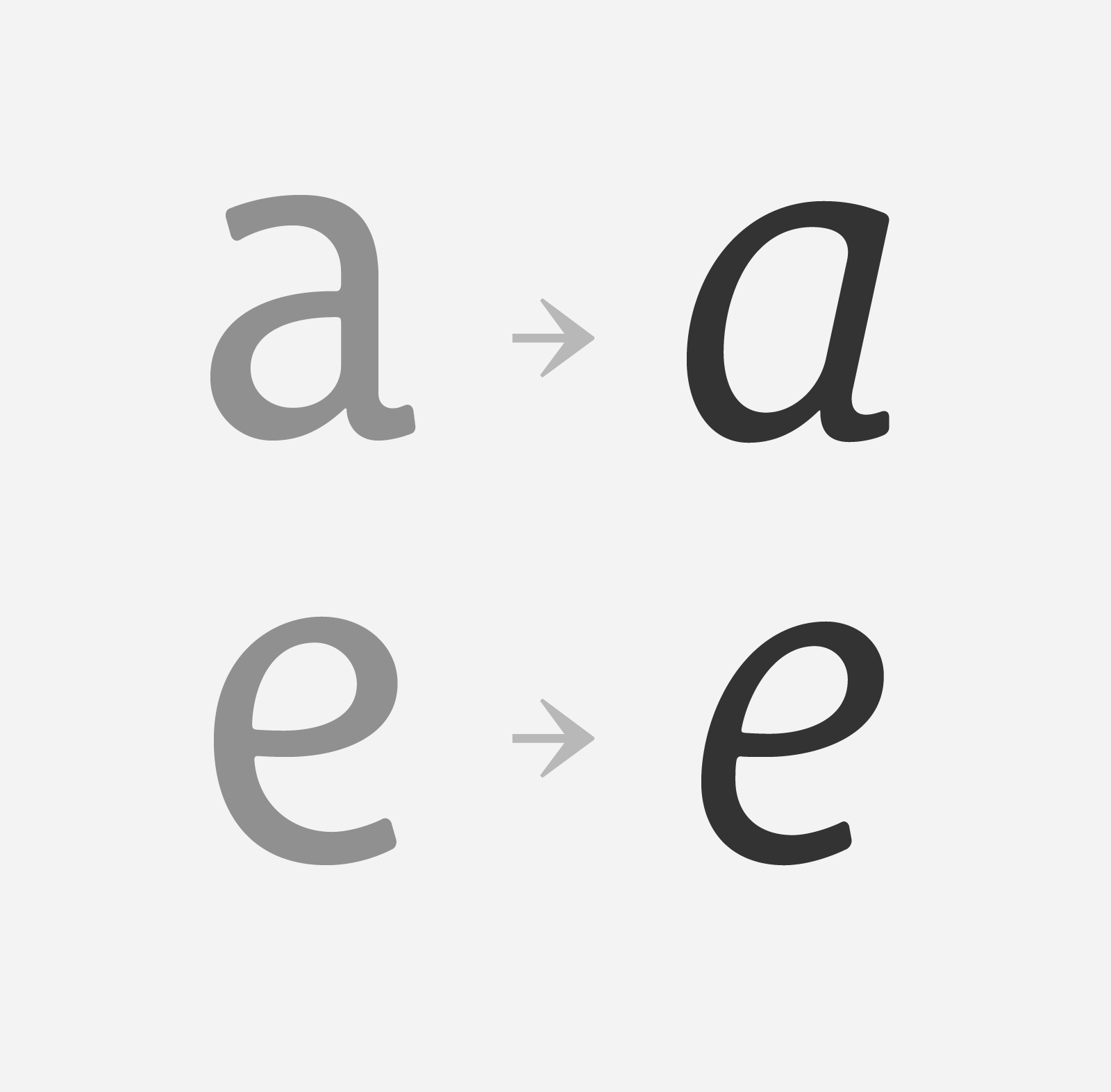
This rounded slab serif returns the informal character of “typewritten” fonts to letters and suit well all bad conditions, from inkjet printed memos to webfonts use. With a unique typographic color, it integrate itself with the rest of the Le Monde family with effective contrast. Le Monde Courrier feature “traditional g and e” (access via OpenType features) in addition to the rounded informal g and e.
By default, the e and g are frankly informal, but via the OpenType functions in Pro version, you can activate an e and a g typical of the great classics of typography.
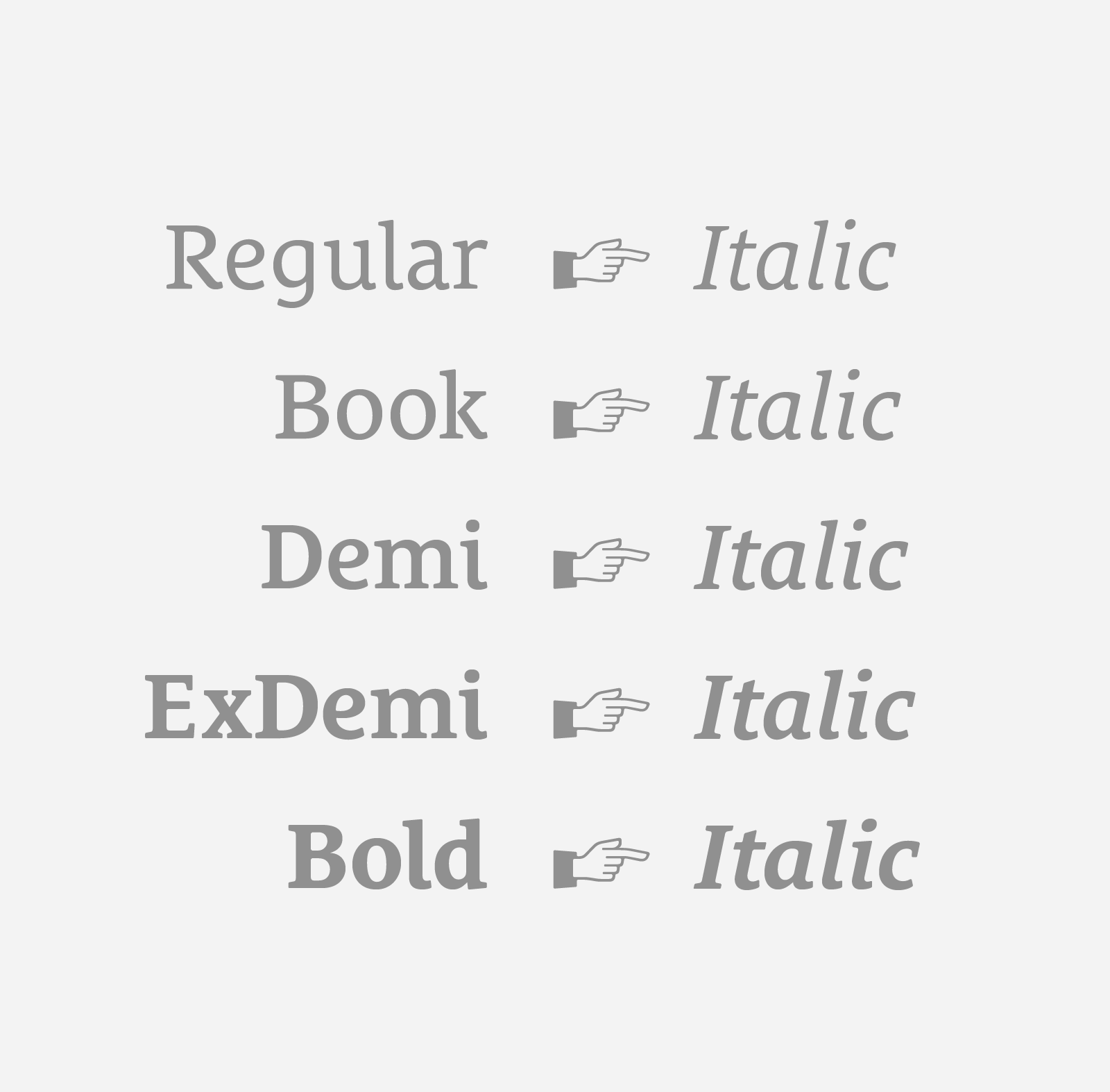
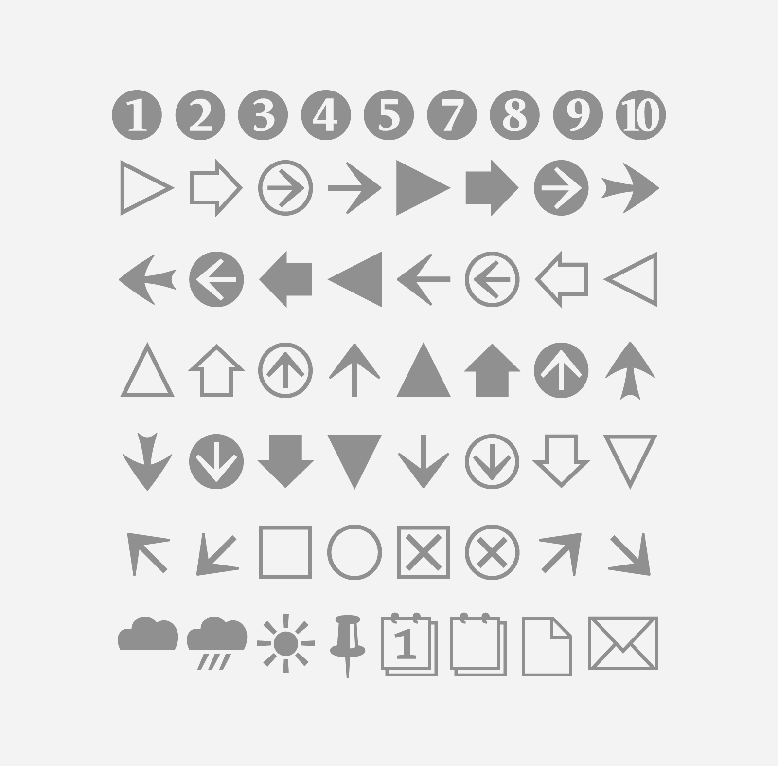
Le Monde Courrier is available in ten series in roman, italic. 700 glyphs by serie available in Pro versions which allows for the composition of numerous Latin-script European languages. Along with small caps available in the five weights, 4 sets of figures are provided — lining and oldstyle — in tabular and proportional widths, depending on the version. Minuscule lowercase, figures for automated fractions, are also included, and in addition a set of dingbats. The verticals metrics and proportions of Le Monde Courrier are calibrated to match perfectly others Typofonderie families.


