Ardoise
About

A straightforward sanserif in 18 fonts
Ardoise met the needs of publications. By extension, it met the needs of a newpapers typeface featuring a low contrast, straightforward forms, as Franklin Gothic. The verticals metrics and proportions of Ardoise are calibrated to match perfectly others Typofonderie families.
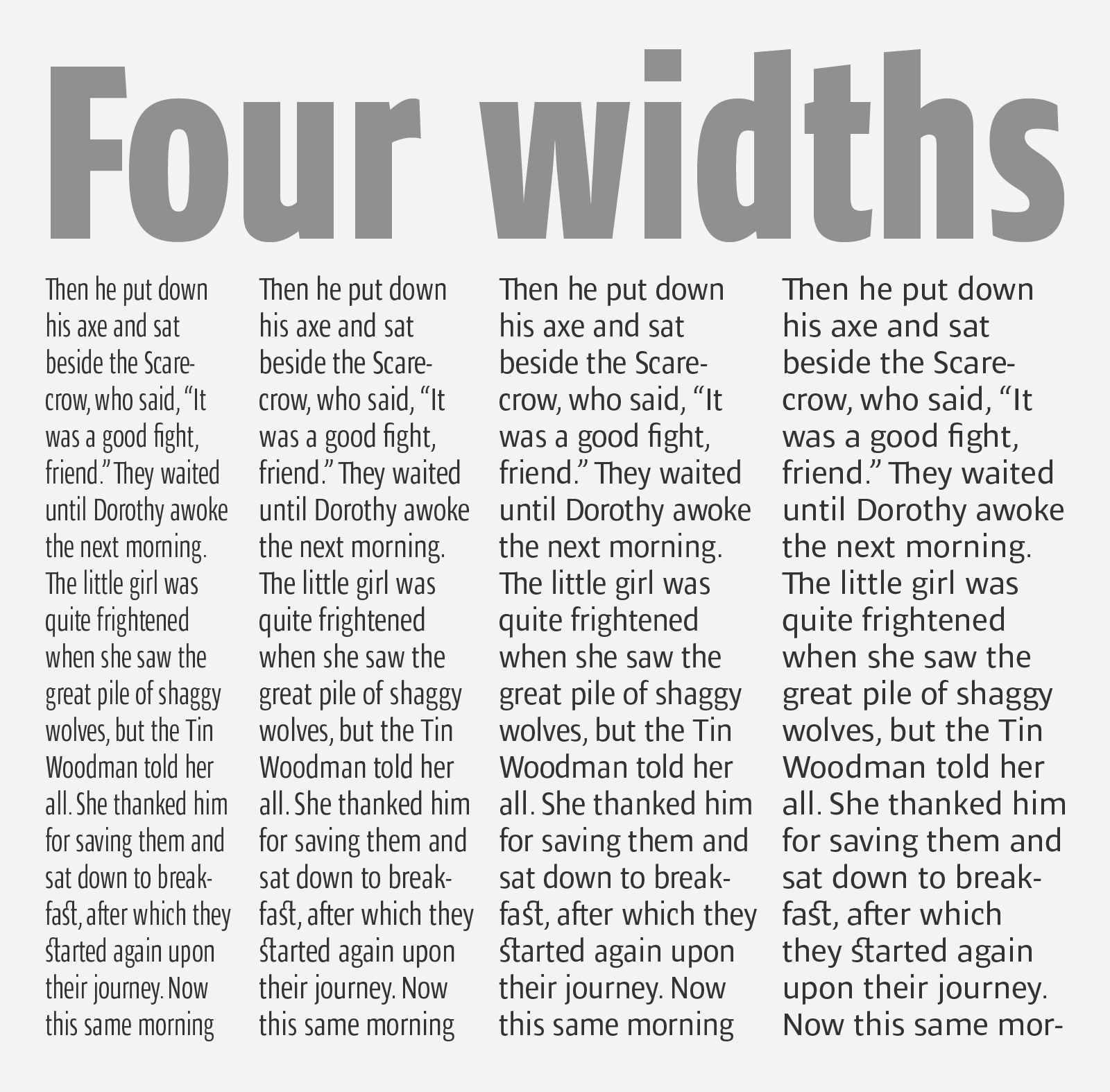
Four widths to answer all situations
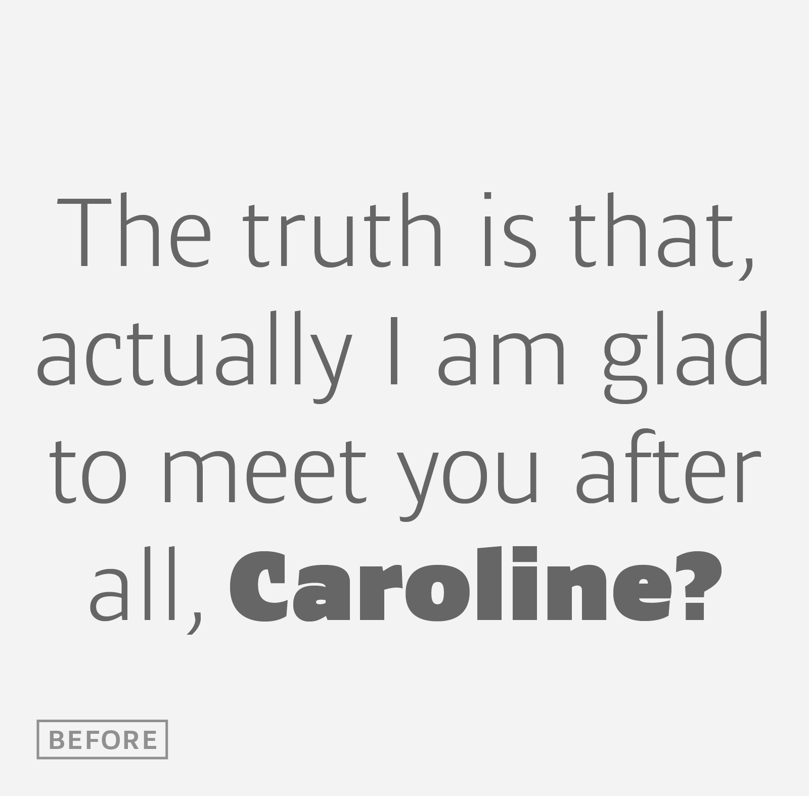
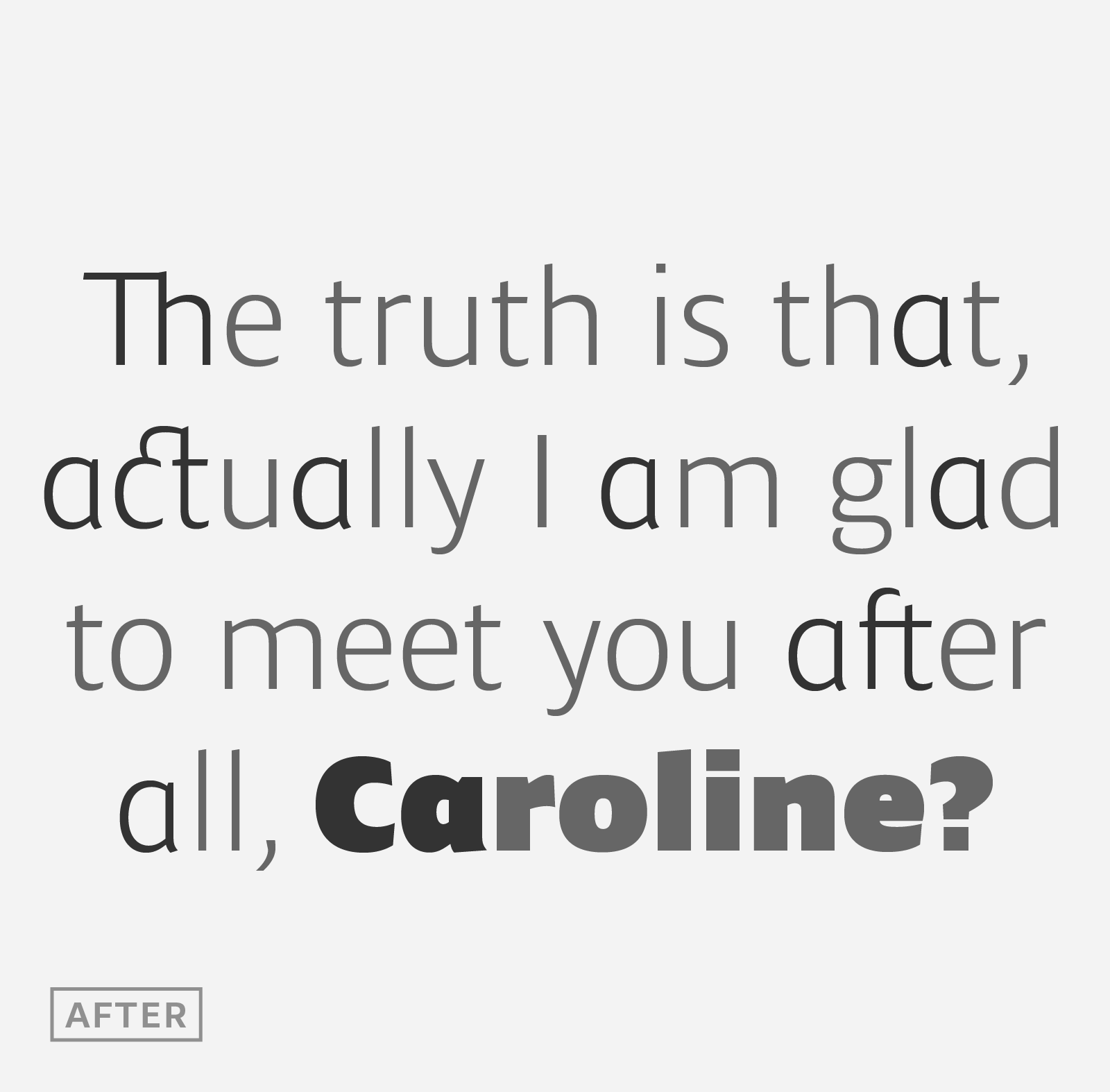
Ardoise, inspired by the needs of today’s fine newspapers offers simple and tense shapes designed to renew and revitalize. Ardoise and its 45 series could be considered as an homage to Antique Olive, but quite indirectly and as an organic result of the designer’s longstanding admiration of the work of Roger Excoffon. Ardoise shares a purity and dynamics with Excoffon’s designs giving it a unique elegance and excellent readability. Its sturdiness means it is virtually immune it to distortion. Each font features a full glyph set covering nearly all languages which use the latin script. All typographic needs are provided for including small caps, various set of figures, dingbats & so on. In addition, a few alternates glyphs (a, c, g, l) can be used to alter the overall tone of a text setting.


