AW Conqueror Stincilla
About


A stencil chic and full of surprises
Why “Stincilla”? It is a Latin word that refers to sparks and sums up the flash produced by the vibration of the typeface. Stincilla naturally refers to Didot and “pochoirs” alphabets.
Back to some historical references
The use of “lettres pochoirs” is very old in France (and elsewhere!). At this time it was a way to imitate calligraphy in ceremonial and liturgical books made before the French Revolution. But these “lettres pochoirs” were only guides to reproduce shapes; the missing lines were finished with a pen. Over the years, “lettres pochoirs” became a genre in its own right. In the 19th century, these “pochoirs” shapes were often constructed from fat Didots. So what could be more natural than using the AW Conqueror Didot as a basis for the AW Conqueror Stincilla!?
Since the beginning of the 21st century, these “pochoirs”, stencil forms have largely surpassed the Didot and other historical typefaces. Look at Georges Auriol and his Auriol Art Nouveau, later Le Corbusier who uses an almost industrial Stencil, named “Charette”, in his projects. Each new decade brings new designs, from the Bauhaus experiments, Chaillot for the TNP, Roger Excoffon’s Calypso, then more recently, Decoder, Jigsaw Stencil, Colonel, Bery Romand and Script, Eames Century Modern, Dada Floda, etc. It’s an endless list. Each in its own way reinvents a restructuring of the letters’ constituent elements, playing on the surprise effect created by the disappearance of certain parts.
It was born of a collaboration
This new family, part of AW Conqueror collection, Stincilla was born out of a collaboration with Champions Design in 2017. Bobby C. Martin Jr.’s team came up with the idea of using a deconstructed AW Conqueror Didot for the visual identity of the TypeCon 2017 conference in Boston. Without them, nothing would have seen the light of day, 6 years later.
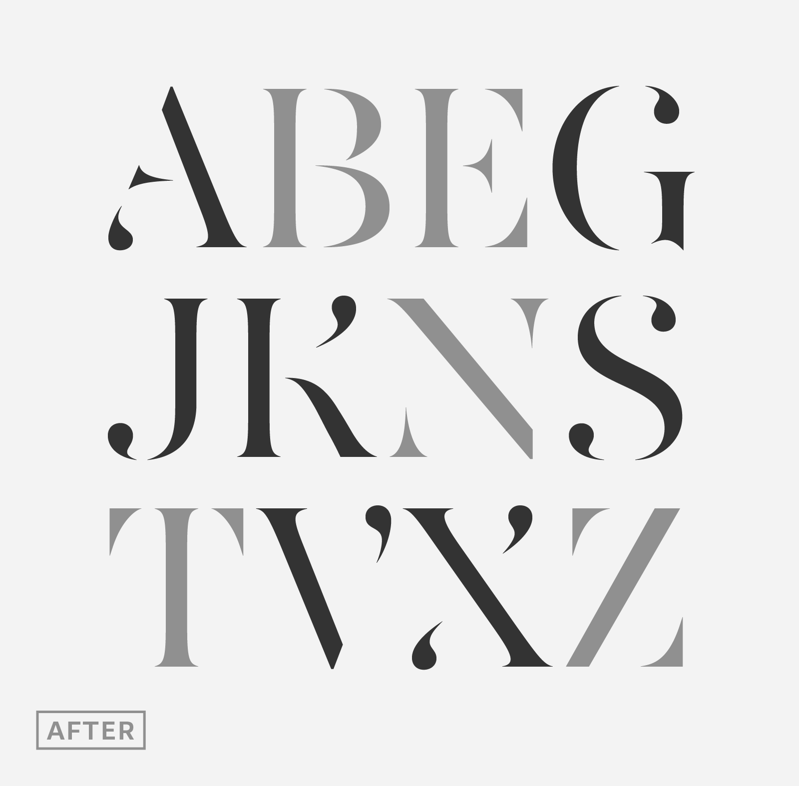
The AW Conqueror Stincilla design
Stincilla design is based on AW Conqueror Didot capitals, but everything has been redesigned. Because removing the thinnest lines means rethinking the balance of each detail; each serif and its position in space, following the disappearance of the slashes and the way they evoke the invisible thinnest lines. New shapes had to be devised in order to suggest parts of the disappeared letters.
Usage and stylistic effects
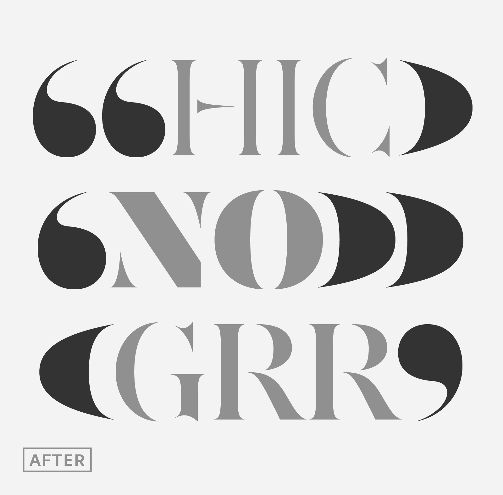
This is clearly a typeface for branding, brand design and logotypes. A certain elegance of form and curves is evident. Using Stincilla is to praise transparency, the superimposition of letters on plain, screened or photographic backgrounds. Each in its own way, the lightest as well as the fattest weights bring different tones.
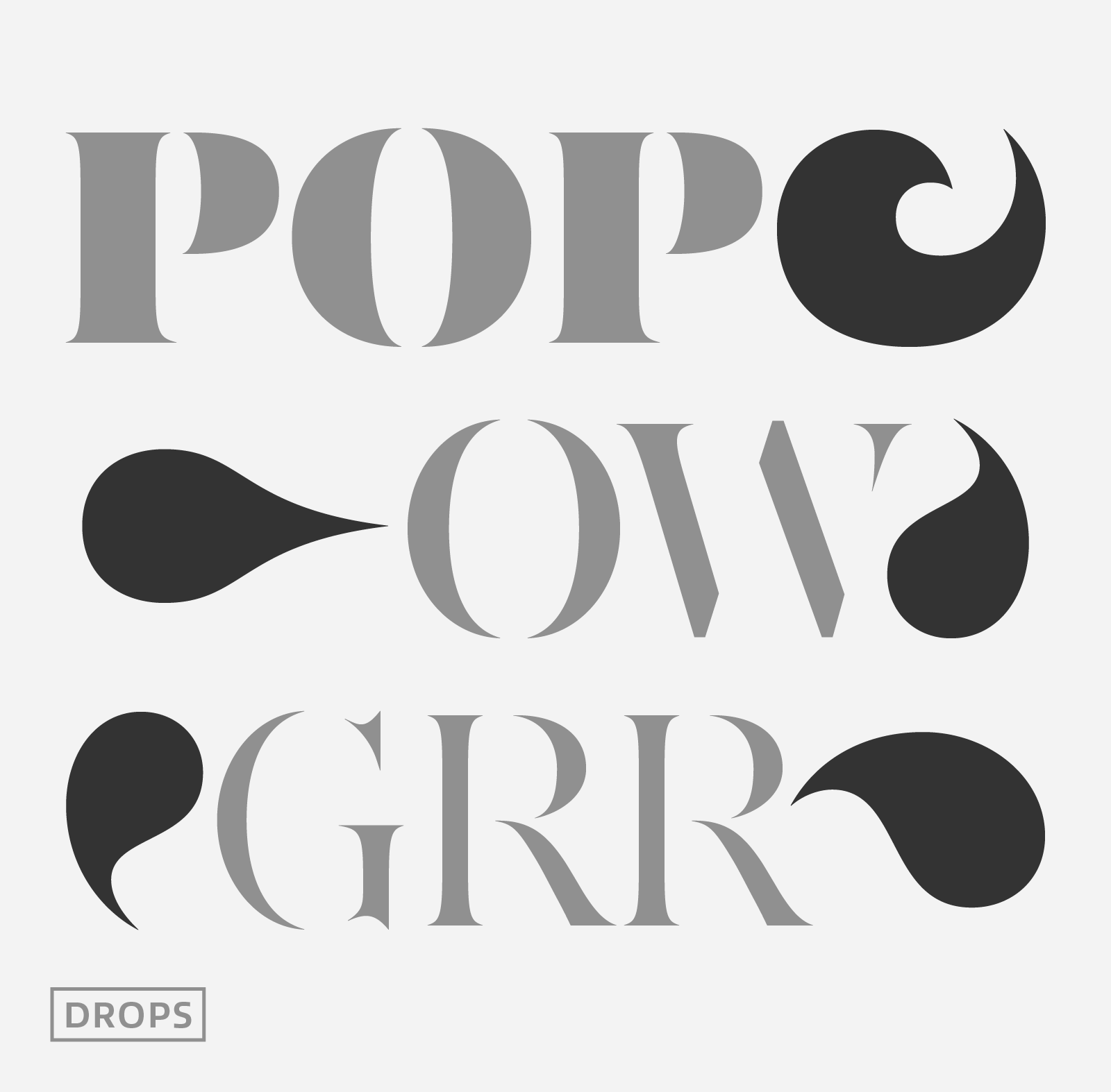
The idea behind AW Conqueror Stincilla is to offer a range of elements that will reinforce your titles and visual identity projects. That’s why we have added ornate variants with different drops, as well as ligatures, vignettes and overs sized quotes at the size of capitals to the AW Conqueror Stincilla.
AW Conqueror was designed from the start to create contrasts in your compositions. Chic and full of surprises, Stincilla will work alone or with Inline, Slab, Carved, Sans and Didot. Its 8 styles are compatible with AW Conqueror Didot and AW Conqueror Sans as well Inline, Slab, Carved families.
The potential of these mixed families is powerful. Because AW Conqueror typefaces are based on an identical structure, and compatible proportions. It’s a great toolbox for easy-to-use titling and text for all graphic designers and enthusiasts, from the most skilled to beginners. All AW Conqueror variants can be used harmoniously, together and in contrast.


