La Tour d’Argent’s grocery store
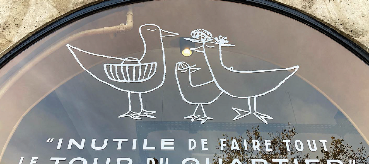

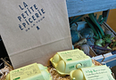
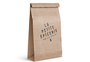
Piaton et associés chose Aiglon for the logotype of La Petite Épicerie of la Tour d’Argent, as well as for the visual identity, including packaging. Aiglon is an open face that meets a variety of European aesthetic canons, very sober yet recognizable, thanks to its unique characteristics: Paris, Milan, Geneva, Berlin. For this logotype, Piaton et associés used Aiglon Milano – The E, F, and H have the high bars often associated with architect’s lettering styles. The A bar, on the contrary is very low. These details, when combined with the large rounded part of the R and P clearly signal that it is an Art Deco style.