Done not Done
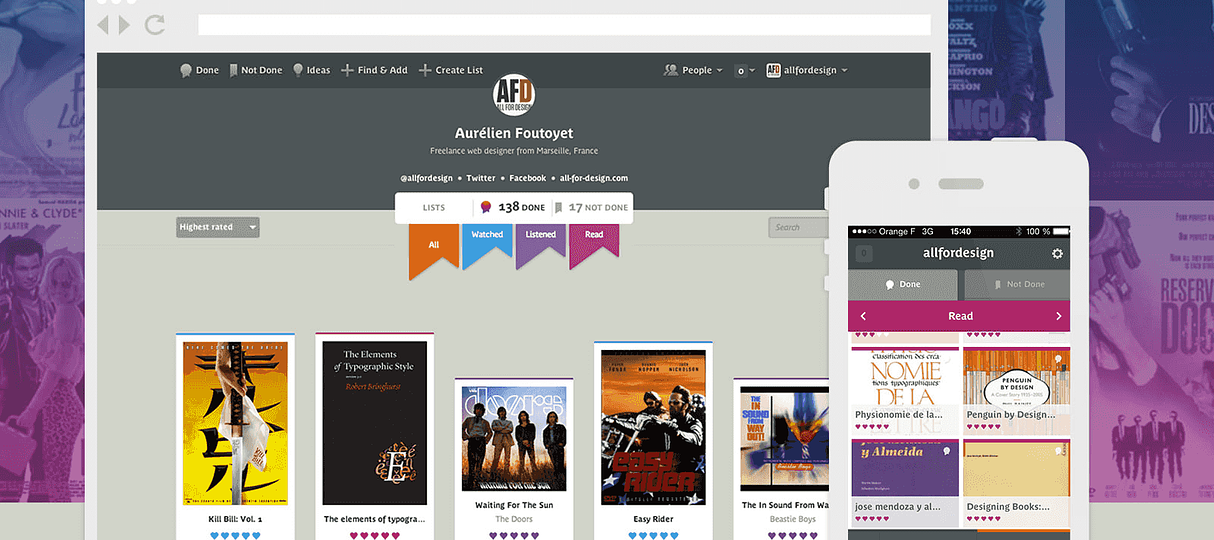

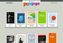

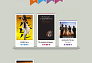


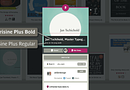
Among the many applications and TodoList web services, Done Not Done is a rather atypical case since it allows the user to focus not on what he “should”, but rather on what he “wants” to do. Here, your desires are classified into three categories: watching, reading, listening. We are far from a stressful TodoList, the “Done not done” look and feel is fun and it is noticeable immediately. To convey this playful reinterpretation of the TodoList concept, the designer Jon Tan at the start of the project, also chose an unusual typeface: Parisine Plus in its OpenType version. With its shapes and unusual ligatures for a sans serif, it represents an informal reinterpretation of the firstborn and much more functional Parisine.
It is generally said that a labor typeface (used for paragraphs) must be invisible, to not disturb the reader. The look’n feel of “Done not Done” seems to be on the opposite side and voluntary use a “remarkable” character as a bias which serves the product visual identity. To conclude, even if from an ergonomic point of view it seems that some improvements can be made in later versions (Responsive web design, search algorithm, cross tabulation, exchange with other members etc.), this service designed by fictive Kin and Betaworks is nevertheless a good example of use of Parisine Plus singular personality.