Parisine
About
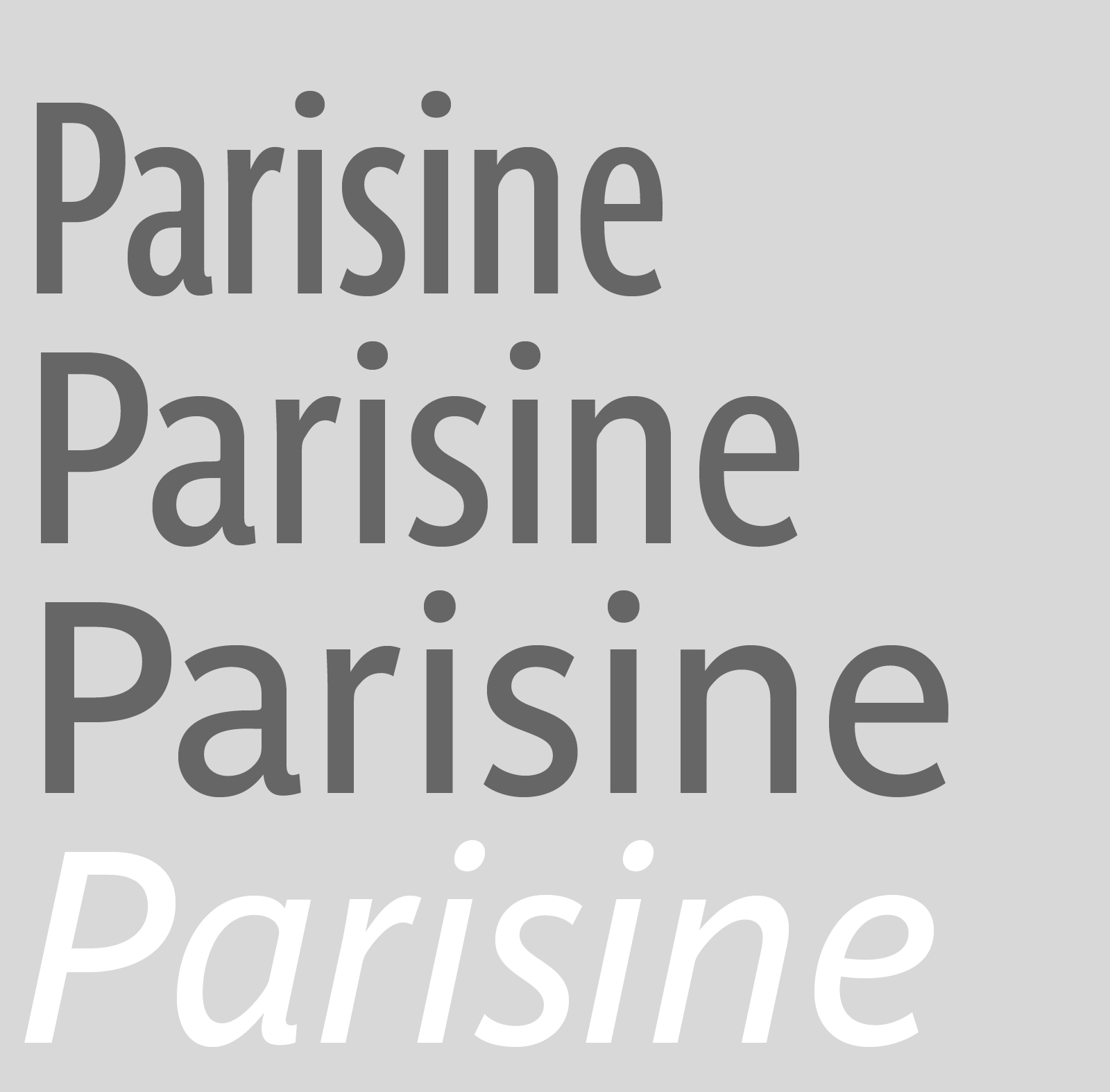
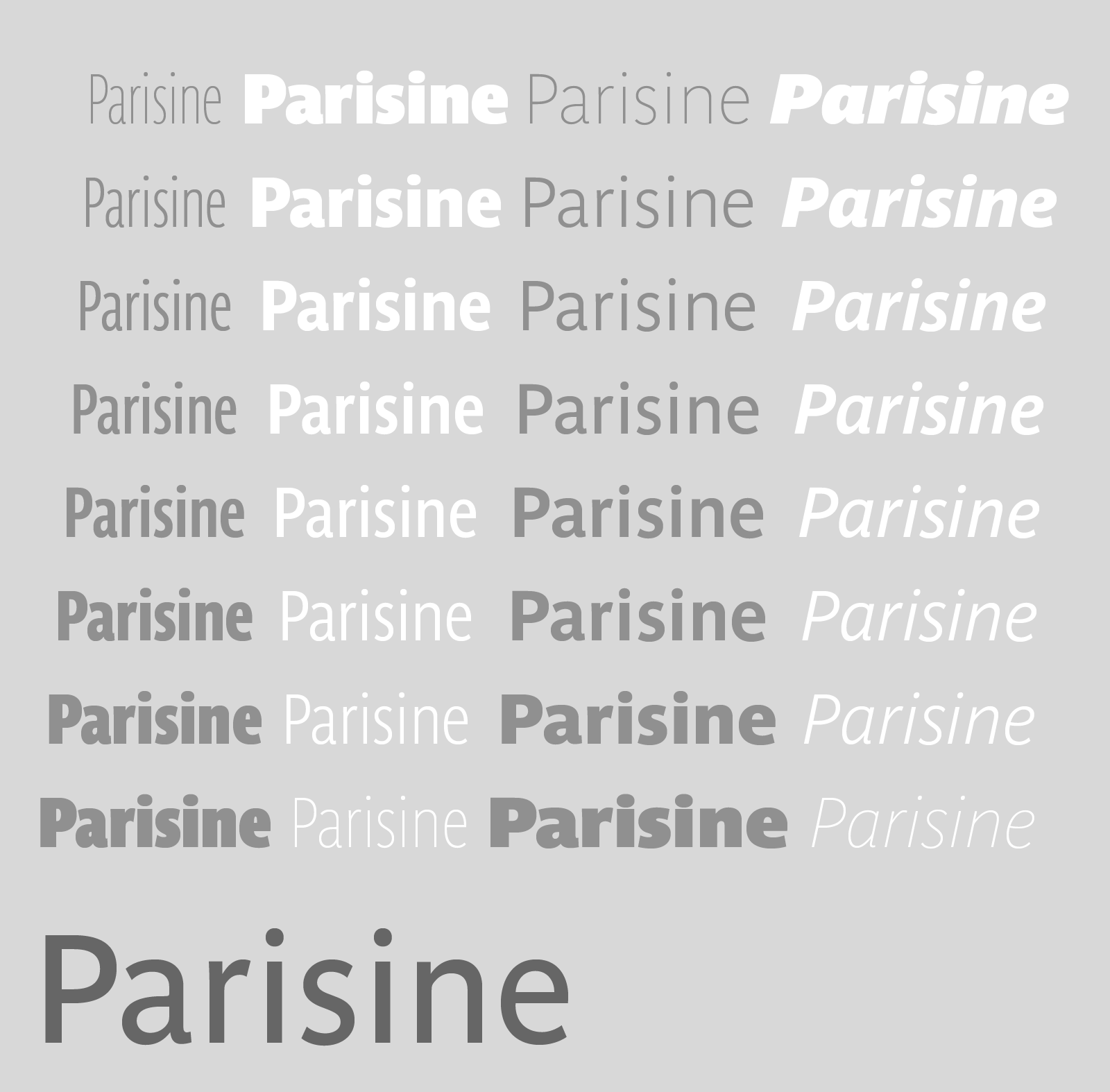

Ultra legible forceful sanserif in 16 fonts
Parisine was born as official parisian métro signage typeface. This family of typefaces has become over years one of the symbols of Paris the Johnston for the London Underground or the Helvetica for the New York Subway. The Parisine was created to accompany travelers in their daily use: ultra-readable, friendly, human while the context is a priori hostile.
Meanwhile, Parisine is now a workhorse and economical sanserif font family, highly legible, who can be considered as a more human alternative to the industrial-mechanical Din typeface family. More human, but not fancy: No strange “swashy” f, or cursive v, w etc. on the italics, to keep certain expected regularity, important for information design, signages, and any subjects where legibility, sobriety came first. Born as signage typeface family, the various widths and weights permit a wider range of applications. In editorial projects, the Compress version will enhances your headlines, banners, allowing ultra large settings on pages. The Narrow version will be useful as direct compagnon mixed to standard width version when the space is limited.
The various Parisine typeface subfamilies
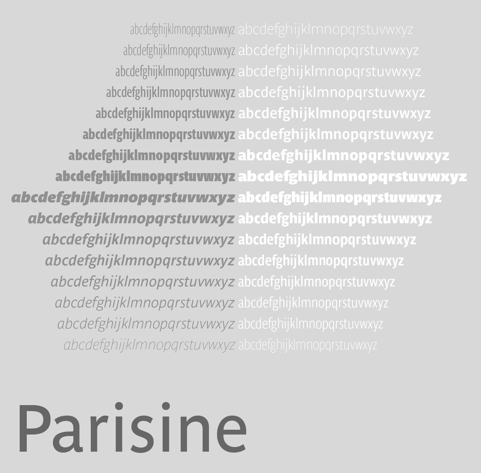
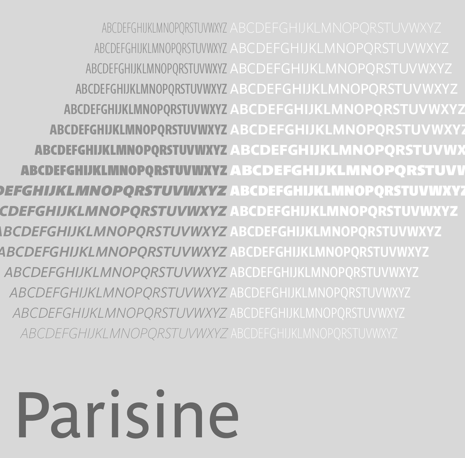
Parisine is organised in various widths and subsets, from the original family Parisine, Parisine Gris featuring lighter versions of the usual weights and italics, Parisine Clair featuring extra light styles, to Parisine Sombre with his darker and extremly black weights as we can seen in Frutiger Black or Antique Olive Nord. Many years of adjustments were necessary to refine this complex family.
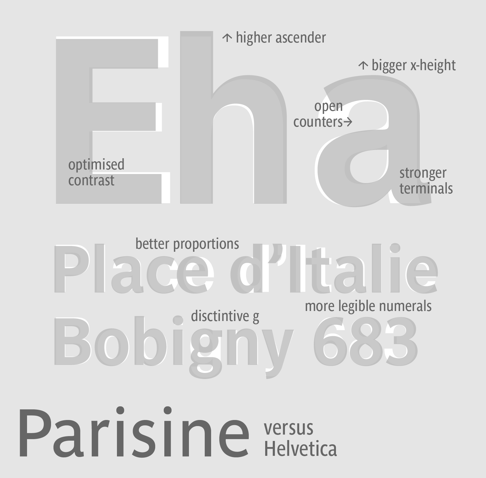
Each member of the family include more than 720 glyphs and feature thousand of kerning pairs. Along with small caps available in all styles, all widths, 4 sets of figures are provided–lining and oldstyle–in tabular and proportional widths, depending on the version. Miniscule lowercase and figures for automated fractions, are also included. Another feature of Parisine is its alternate f ligatures. With the contextual alternates feature, a short top f will automatically replace the standard f in front of glyphs such as ì. The f ligatures of the original Parisine were designed disconnected to ensure perfect legibility in signage (and to be seen) where real traditionally-joined forms would not be suitable. The OpenType version of Parisine fonts and its stylistic set 3 feature switches from these disconnected f ligatures to joined forms. The contextual feature replaces as well the sequence“word space-en dash-word space” by an en dash with surrounding fine spaces. Stylistic set 5 converts the connected c cedillas to disconnected c cedillas. Stylistic set 6 replaces caps ’A’ through ’H’ and lowercase ’a’ through ’h’ with multi-directional arrows.
Initially, Parisine was designed by Jean François Porchez in 1996 for Ratp to solely fulfil the unique needs of signage legibility. Parisine remain the official corporate typeface of the public transport in Paris, the worldwide capital for tourism, and now integral part of the French touch.
Directly related, Parisine Office was initially created for Ratp’s internal and external communication, Parisine Office is available at Typofonderie too. Not connected with Ratp and public transports, Parisine Plus was created as an informal version of Parisine.


